Learnboratory is a project aimed at establishing a modern learning center that delivers internationally standardized education to Thai youth. To make this more relatable, I've explored a logo concept that integrates the Thai character “รู้” (which means “to know”) with the letters “L” and “B” from LearnBoratory. This subtle creative fusion forms an expressive human face, presenting friendliness, curiosity and a determined spirit of lifelong learning.
*This project was developed as a concept for a pitch proposal and remained in the experimental stage, exploring design approaches and creative directions.
Proposed logo
Secondary Logo and Logomark


Colour Palette
The colour palette chosen reflects the essence of learning. The grey offers a calm and reliable foundation, promoting focus and clarity, while blue inspires curiosity and highlights energy and importance.

Brand Graphics and Applications Inspiration
The strength of this symbol-and-script-driven concept lies in how flexible and meaningfully it can scale across brand applications, from educational environments to printed collaterals, digital spaces and brand storytelling.
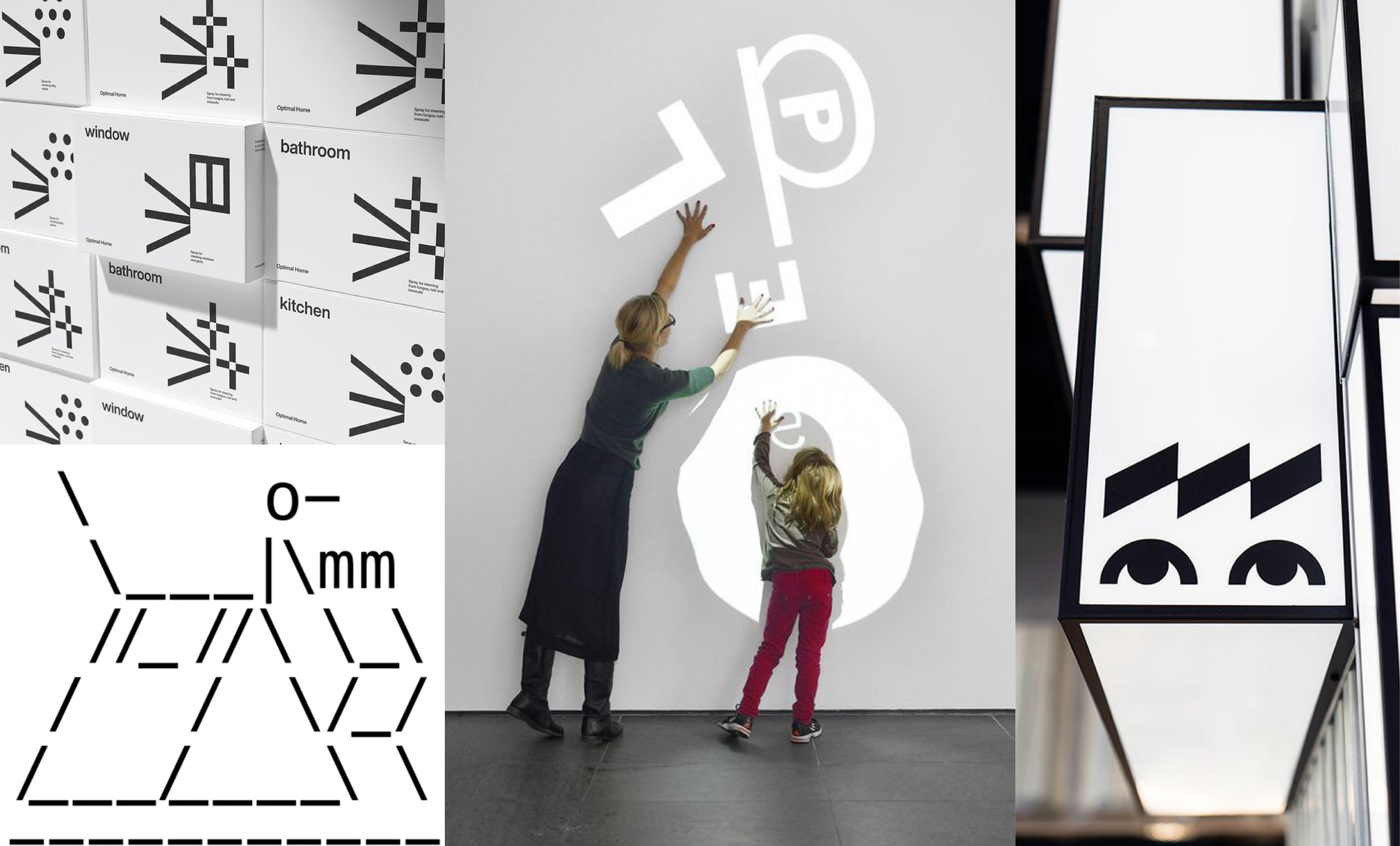
*Reference image sourced via Pinterest. All rights belong to the respective owner.